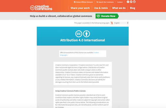
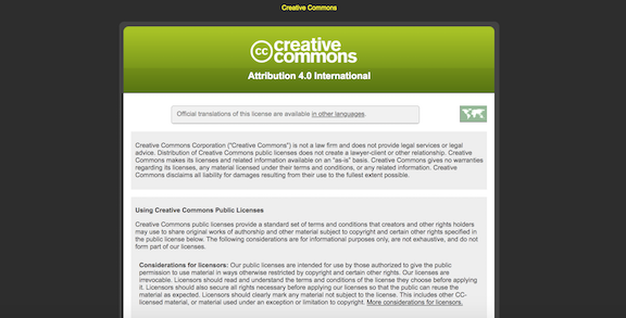
Last week, we launched a redesign of Creative Commons’ various license (aka “legal code”) pages. See one for yourself. In this post, I’ll spell out what the changes are and why we made them.
The most obvious change we made is updating the overall look of the pages so that they resemble the rest of the Creative Commons website, which was redesigned back in September 2016, as well as the CC license “deed” pages (e.g. the CC BY 4.0 deed), which were redesigned in 2017. We’d always intended to pull the design of the license/legal code pages up in line with the deeds, but the deeds took precedence, since they are the most frequently viewed pages on our website. I’m happy to say that we’ve finished the project with this latest design update.
Along with this look-and-feel overhaul, we wanted to ensure that the license/legal code pages were more mobile-friendly. The previous design was released well over a decade ago, before the typical web user was likely to be viewing CC licenses in a mobile display. We noticed that reading the text of a CC license was difficult on many types of mobile devices, and it was important to us to fix this. Text and images in the new design automatically adjust to better fit the type of experience you are using to view the license.
We also added a brand new feature–one we liked so much that in tandem with the license page overhaul, we ended up extending it to the deed pages as well. This is the translation menu pulldown tool, also known as the “language switcher.” Previously, to see the content of a license or deed page in another of its translated languages, you would hit a link at the top of the page (“Official translations of this license are available in other languages”) or scroll to get to the very bottom of the page where you would then see a list of the other available languages, each one linked to the corresponding translated page. This worked fine, but we wanted to improve the experience of getting to a new translation. The new translation menu tool sits right at the top right of the license and deed pages and enables you to easily identify which languages the page has been translated into, and more quickly select the one you’d like to view. We also kept the list of translated languages at the bottom of these pages intact, in order to accommodate those who are used to identifying and viewing translations that way.

The new translation menu tool (aka the “language switcher”)
Additionally, we made a handful of smaller changes that are intended to help people better use the licenses. First, the new design includes the website header that is used across the rest of creativecommons.org. The old license design did not include this, making it somewhat difficult for a person who landed on the license page via a search result or a link from an external site to understand where exactly on the web they were. By adding the website header to the license pages, we hope to do a better job contextualizing for people that the license is part of a much larger system, and to give them a much more direct path to learning about Creative Commons generally and getting involved with the CC community.
Lastly, we made two more tweaks focused on improving the experience of using the licenses. There have long been two pieces of text that precede the actual terms of a Creative Commons license on the license pages–a disclaimer at the top followed by a brief list of considerations (the part entitled “Using Creative Commons Public Licenses”). This content is extremely important, but we realized that in the previous design of the pages, it could be tough to differentiate between it and the license terms that follow. In the new design, the disclaimer appears in italics, while the considerations are presented in a truncated style–the first few lines of each of the two considerations appear above a small button that enables you to expand these sections to read more.
We’re excited about these changes and hope that the public finds them useful. A big thank-you to Diane Peters and Sarah Hinchliff Pearson, CC’s general counsel and senior counsel, respectively, for all their help in getting our list of changes into shape. Also a huge thanks to the folks at Affinity Bridge, the web development and design firm who helped us take our ideas for these revised pages and make them live.
Posted 11 July 2018

