


This is part of a series of posts introducing the projects built by open source contributors mentored by Creative Commons during Google Summer of Code (GSoC) 2019. Maria Belen Guaranda was one of those contributors and we are grateful for her work on this project.
“By visualizing information, we turn it into a landscape that you can explore with your eyes.” David McCandless
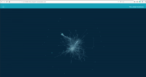
Force-directed graph, “The Linked Commons”, uses one month of data.
The landscape of openly licensed content is wide and varied. Millions of web pages host and share CC-licensed works—in fact, we estimate that there are over 1.6 billion across the web! With this growth of CC-licensed works, Creative Commons (CC) is increasingly interested in learning how hosts and users of CC-licensed materials are connected, as well as the types of content published under a CC license and how this content is shared. Each month, CC uses Common Crawl data to find all domains that contain CC-licensed content. This dataset contains information about the URL of the websites and the licenses used.
Using the Linked Commons
In order to draw conclusions and insights from this dataset, we created the Linked Commons: a visualization that shows how the Commons is digitally connected.
In the Linked Commons, nodes (units in a data structure) represent websites of an organization, person, academic institution, etc. A link between nodes exists if one website hosts CC-licensed content that belongs to or is hosted by another website (as indicated by a URL link). A community represents a group of websites that are closely related to each other because they produce and/or share CC-licensed content between them.
Vast quantities of data make any web browser render elements slowly and may eventually freeze. Due to the 100k nodes included in the Linked Commons, the visualization initially took a long time to render and had a clustered appearance—this was a major concern.
That’s why we decided to use data from only a single month and chose the top 500 websites containing links to CC-licensed material, as well as all of the other domains those 500 nodes are connected to. In addition to lessening the loading time, we found that this was also more user-friendly because navigating the entire dataset’s graph would be dizzying. Even with this smaller dataset, we were able to gather valuable insights from the graph, including discovering subcommunities of CC license hosts and users. One such subcommunity is shown in the image below.
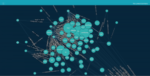
Educational community, including libraries and universities.
The subcommunity above is an “educational” community; made up of libraries, universities, and schools.
Visualizations like these are valuable for CC because they can help guide our outreach efforts and targeted communications. The CC Search team can also use this data to choose which domains to prioritize indexing in the CC Catalog.
The visualization is interactive; users can pan, zoom in and out, hover over a node to see its neighbors, and click on a node to display a pie chart, like the one below. We encourage users to test out the Linked Commons and see what insights they can gather from this information!
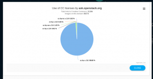
Pie chart of ask.openstack.org.
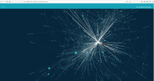
Force-directed graph, “The Linked Commons”. Neighbors of domain svgsilh highlighted.
What’s next?
We plan to continue working on the Linked Commons. Here are some features we hope to add:
- Live updates—The graph is currently static because it uses a single month’s data file that has already been processed. We would like to automatically update the graph as soon as new data is processed.
- Filtering domains by country—Some domains have suffixes that represent countries, such as domain.au which corresponds to a domain from Australia. We plan to use these suffixes to filter nodes in the visualization by country.
- Filtering domains by name—A user might want to check if a specific domain has CC-licensed content and how that content is used. We plan to add a search bar and provide the user with the ability to search for a specific node given a domain name and/or URL.
Interested? Check out the Linked Commons here!
Give us your feedback!
The Linked Commons is an open source project. The project’s source code is available in the Github repo. Contributions are welcome! For the technical details of how this project was developed, please read this series of posts on the CC Open Source blog.
Posted 23 January 2020