Help us protect the commons. Make a tax deductible gift to fund our work. Donate today!
The story of the Creative Commons (CC) logo is linked to the story of CC.
In 2002, just one year after the founding of CC, designer Ryan Junell accomplished the difficult task of designing a logo that is distinctive, yet teaches through its design. Over time, the CC logo has become a recognizable symbol of the open movement, even accepted by the Museum of Modern Art in New York as a permanent addition in 2015.
![]()
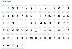
Once the logo was designed, however, it was difficult for Junell to decide on the font for the rest of the CC mark. Generally speaking, designers make their choice on typography based on readability and distinctiveness. Sans typographies, for instance, are considered a standard basic element because of their clean shape and lack of ornaments, keeping the writing structure intact. That allows the text to be combined with other visual elements without competing on information hierarchy or expression. In a way, sans typographies provide both a neutral and an eloquent voice. Junell probably had that in mind when he selected the elegant Akzidenz Grotesk font (designed in 1898!) for the CC logo.
Since 2002, CC licenses—and the CC logo—have been used to share and make freely available billions of works in the Global Commons. CC has also grown to include an active Global Network, consisting of 41 local CC Chapters and over 450 members who use the logo to support their work.
Due to this growth, we realized in 2018 that the original Akzidenz Grotesk font was not ideal for members of our Global Network to adapt and remix. We wondered: Can we develop an open-licensed Creative Commons font? Thanks to the kind support of a CC member, we did.
Today, we’re happy to introduce—and make freely available—CC Accidenz Commons.
CC Accidenz Commons was designed by Archetypo, a research and type design collective based in Germany and Chile. Archetypo designed the font under these basic premises:
- To establish a quality framework for a typeface based on the original design of Akzidenz Grotesk
- To improve the original canonic design that precedes Helvetica and optimize it for better Webfont visualizing
- To design a versatile text weight to be used in CC’s identity and logo, as well as in headlines, presentations, and other text applications
“We wanted a new Akzidenz version with less contemporary expression,” Archetypo explained, “[while] trying to remain close with the original metal carving of the font.” This meant:
- Re-drawing the original Akzidenz Grotesk font, using different wide and long proportions. In the process, we considered the use of low caps and relative weight for better visualization in text applications.
- Including small openings in the blank space of a sign where elements connect, such as on top of the “n” and at the bottom of the “a.”
- Re-drawing many of the curves, unifying lower and upper cases.
The end result was CC Accidenz Commons: a contemporary, versatile, and neutral version of Akzidenz Grotesk. The font is licensed CC BY-SA, so you can download it today and start remixing!
Posted 28 October 2019